Friday 11 December 2009

Evaluation Viet

Media Evaluation

In what ways does your media product use, develop or challenge forms and conventions of real media products?

Our media product conveys the main conventions of real media products of the same genre. We researched into magazine adverts, DVD covers and other music videos using the internet and the ‘YouTube’ website in particular to form an understanding of our track genre which was ‘Indie’ and discovered the main conventions that they portrayed. We particularly focused and looked at Paolo Nutini video ‘Candy’ and Daniel Powter’s ‘Bad Day,’ because they both engaged us and had a good vibe and atmosphere about them.


We noticed that the main conventions of these videos were that they narrated a story, had cuts to the artist singing alone and had a woman of attraction in it. These were the main conventions of indie music videos and we planned to re create this in our own media product and by mixing the strongest points of each video would help us in creating an overall high quality finish. In ‘Bad Day’ there were multiple split screens which each screen having a different story line to the track and in ‘Candy’ there were close ups of the artists in a rural background, we felt that this enabled a strong representation of the artist to be created in the ancillary products whilst still engaging the audience to the music video. Therefore in our final music video, we have included a story line, cuts to the artist singing alone, split screens with different story lines and close ups of the artist singing which has followed the general conventions but also developed them by a mixture of the two videos that we focused on.

How effective is the combination of your main product and ancillary texts?

Overall the combination of our main product and ancillary texts are very effective in creating a consistent image of the artist. Through having constant close ups of the artist singing in the video whilst wearing indie props created a visual image of the artist that ran throughout the work, this was replicated on the DVD cover and the magazine advert. The visual image is a casual, down to earth guy, an image that has intertextual references to Jack Johnson and Paolo Nutini, artists that are already well established in the field.
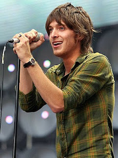
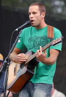

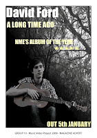
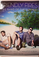
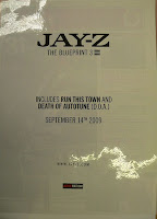
We analyzed two current magazine adverts that we felt were effective in promoting themselves. We used a Jay-Z advert and a Friendly Fires advert, two very contrasting adverts visually yet but both effective in promoting their respective album. We noticed that these magazines had essential conventions to promote themselves and their album. Friendly Fires had quite a conventional magazine advert, having a striking background and images of the band. Where as Jay-Z is not initially bold and striking but because of this, it tells the reader that he does not need to promote himself with an image or a striking background because he is so well established, almost making it more effective than the Friendly Fires advert. Therefore in our magazine advert we have incorporated a subtle image that doesn’t solely focuses on the artist because of the background and is therefore not too overpowering similar to the Jay-Z advert. We believe that in doing this, this will be more effective than a whole page on just the artist.
The DVD cover consisted of all the essentials, the bar code, the rating, title and the DVD symbol. It carried on with the indie representation of the artist that we have tried to develop throughout the work but with developed this further. We changed the colour scheme so that the customers would be instantly attracted to it and buy it.
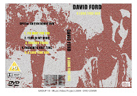


Therefore overall, taking into account all three products, it is very effective in continually maintaining an indie presentation of the artist that makes him easily recognizable and distinguishable which helps the audience/customers buy his work.

What have you learnt from your audience feedback?

Our audience feedback has been essential in developing our main media and ancillary products. In gaining feedback we were able to build on our initial idea and develop it so it would be more effective in presenting the vital conventions that we wanted to portray. We were able to gain valuable feedback throughout the production of the video. Initially the peer feedback to our rough cut was pleasing, but problems were pointed out. We had numerous blank video that needed filling in, from that we knew that because we used actors that were not part of the group we had to work to there time constraints which hindered the production of our video. We did however discover that the main conventions we wanted to portray were effective as peer feedback noticed and complimented the split screens, cuts to the artist singing, lyrics and visual and woman storyline. Our peer feedback from group Q1-11 was ‘Other feedback: We think that the shots containing the male character, he should either play the guitar or look like he is playing the guitar’ so we incorporated this on the next shooting task, which when viewed later on fitted in with the genre of the song. Other feedback was that we had footage that was repetitive, so we knew that when we used our last filming slot we had to cut to scenery so our video did not become boring and drag on. Peer feedback did notice the strong relationship between lyrics and visual though, which we were very pleased because this was one of our main conventions we wanted to portray.
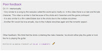
Therefore we have learnt that audience feedback was a major part in the completion of our product, throughout each stage of creation feedback allowed us to develop and expand on our idea. In particular, through class feedback, it was as if we had a sample target audience who we wanted to appeal to and this helped us the most.


How did you use new media technologies in the construction and research, planning and evaluation stages?

New media technologies were apparent throughout all stages of the media product. The internet was vital in research and planning, we viewed numerous indie videos on ‘YouTube’ to gain an overall understanding of the genre and its conventions, we used ‘BBC’ to check weather forecast to plan when we would film and used ‘Google’ to evaluate our ancillary products to other products already established. The internet was a key factor in the production of the product because without we would of not been able to gain a good understanding of the main conventions and been able to plan it.
‘Final Cut’ was the editing program we used to create our overall video, tricky at first, we had to learn how to split screen shots and make them move by adding in key frames. It is a very user friendly program which made it easy for us to play around with filters and create the image we wanted to. After finding a video filter we liked, we were able to apply this to all shots very easily and efficiently which made our shot look more professional without being time consuming. Editing the speed of certain shots allowed us to create a slow tempo which complimented the beat of the song and video transitions made our video flow throughout.
‘Final Cut’ was essential in creating a slow tempo, which also added to the nice, down to earth representation of the artist.
‘Photoshop CS3’ was how we created our DVD cover and Digipak. At first, layers were confusing but after figuring out the initially complicated layout, everything was very easy and quick to use. On the DVD cover, we changed the colour of the picture so it would stand out and attract more customers whilst still maintaining the cool vibe of the artist. We also added a filter to the font ‘Impact’ to make it clearer and bolder. The magazine advert we mixed two images together applying a mask to one and then added a gradient so it would look smooth. There are many capabilities in ‘Photoshop’ that had us spoilt for choice.
Overall new media technologies were crucial in the completion of our product. Through using the internet, ‘Final Cut’ and ‘Photoshop’ we created and maintained an image of the artist that is instantly noticeable and effective.

Thursday 10 December 2009

Digipak and Magazine Advert


Evaulation by Ashlea

In what ways does your media product use, develop or challenge forms and conventions of real media products?
During the planning and research stages, we decided we wanted to produce a very conventional product, as we were greatly inspired by other products of an indie/acoustic genre and thought that by including typical conventions, our product would be more successful and appealing to an audience.

The convention of using photos as a representation of how time has changed is used in many other media products of this genre, e.g. the music videos ‘Dream catch me’, by Newton Faulkner and ‘Bad day’ by Daniel Powter. By including numerous shots of him playing the main instrument of the song, him wearing indie clothing and close ups of the artists face and guitar, not only were we able to create a stronger identification of the artist, this helps communicate the genre of our product to the spectator.
This mise-en-scene can be compared to many real media products such as the Jack Johnson Album cover e.g. the guitar and natural environment setting, which like our product, focuses on simplicity. In our music video, we also included frequent cutaways to scenery and outdoor settings which helped us create a more picturesque side to it and execute the same laidback feel. Many indie/acoustic videos use cutaways for the same purpose, and Jason Mraz’s music video to ‘I’m Yours’ is a key example.
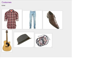
We were inspired by the costume style of the band The Kooks as in most of their videos they dress quite quirky and have a clear indie style. As they are a young, well-known popular band we decided our artist would have a similar style, for example he wears a loose checkered shirt, and the Kooks’ signature clothing item of their videos; skinny jeans. As this is quite a modern, stylish fashion amongst young people, we thought this would strongly appeal to our target audience; teenagers and young adults, with an interest in this music genre. The artist is also wearing a festival wristband, which would be recognisable amongst many young people who are into indie music, which gives an audience stronger identification of the artist, his style and the music genre.
Our product is mostly very conventional to professional ones, however I didn’t notice many split screens in videos of this genre, instead, they are mostly used with up tempo or mainstream tracks e.g. the music video to Daniel Powter’s ‘Bad day’. However we used these anyway as the use of split screens are a great asset to our video as many shots such as the pub scene help narrate the storyline, comparing past with present.
When looking at the camerawork of the video ‘Dream Catch Me’, we specifically liked the frequent use of slow panning shots as we thought these would work well with the slow tempo and would enhance the solemn mood of our song e.g. when the artist plays the song’s instrumental part.

How effective is the combination of your main product and ancillary texts?
We wanted to produce ancillary tasks which would effectively help an audience identify the indie/acoustic genre of our product. Our ancillary texts have a strong relationship between each other and our main product as they include similar visual characteristics e.g. colours used, filters etc. The same dark, colourless effect was used in both music video and ancillary tasks in order to create continuity and for a spectator to identify a more obvious relationship between them. We used frames from our music video as central images of our ancillary tasks, as we thought shots of the artist in the field, were particularly strong and conveyed the meaning of the song well. Through using similar mise-en-scene of both ancillary tasks, this distinguished characteristics and a stronger visual representation of the artist, music and genre, as a spectator buying the product will be able to see the same clothing worn by the artist, and editing of the image e.g. dark filters etc.
The digipak and magazine advert had to look a little more stylized than the music video and needed to be more eye-catching and attention-grabbing as it was a still image and motionless. We tried to achieve this by still keeping the similar colour scheme to the video, but adding yellow on top of darker backgrounds which added a lot more emphasis to the text of both magazine advert and digipak cover. We stylized the image on the digipak cover a lot more, putting a more obvious, dynamic filter over it which looks more striking and professional.
Another strength of these three components is they all show voyeuristic treatment of the artist, keeping in tone with the song and its melody, and show how the artist is unaware the audience are listening to his thoughts and feelings. I think the back of the digipak is very effective, as it’s a voyeuristic image of the artist of the artist from behind has a blurred, unfocused effect over it, complementing the cheerless, melancholy mood of the song very well. We took inspiration from the album cover ‘Hold back my heart’ by Michael Johns as it had a similar message to our chosen song, used similar neutralised shades to our video, and the focus is voyeuristic image of the artist playing his instrument. From the picture below, it’s clear to see we took inspiration from the yellowy, ‘rusted looking’ font used.
Referring to Goodwin’s points, voyeuristic treatment and objectification of mainly women are generic conventions of media products, however in the case of our product; the artist is the person being objectified. For example, from the magazine advert, the image has been cut only showing a sector of his body without his face, which shows a more objectified impression of him to the audience as this is the only part of him they are invited to look at. However we manipulated the image in this way mainly to show the equal importance of the guitar and the artist, as the relaxed hand positions on the guitar, artist’s casual clothing, and tattered guitar strongly contribute to quite an unglamorous, laidback, indie feel.

What have you learnt from your audience feedback?
When presenting our pitch to our class, we were given feedback on strengths and weaknesses of our planning and how we could expand on our ideas. We took all of our feedback into consideration and it was recorded on our blog, enabling us to track progress. Our roughcut was given a lot of our feedback on how it included strong lyrics and visuals e.g. group Q1- 12 added – ‘Complementary lyrics and visuals for example when the singer sings about a girl near the cigarette machine you see a girl near a cigarette machine’ which we were happy about as we really tried to demonstrate Goodwin’s point of relationship between lyrics and visuals in our planning stages. As expected, we received a lot of feedback commenting on the gaps that we needed to fill of our roughcut, as we had a considerable amount of gaps without footage. This was due to our poor time-keeping skills at the beginning as we took too long during the planning and researching stages, deciding on how we wanted our product to look, instead of actually filming it! This was a weakness that we soon overcame, as we realised in order for us to make the best of our video, we had to finish shooting the footage we needed quickly in order for us to save as much time as possible for the editing process; which we knew would be the most time-consuming aspect of the project (due to the editing techniques effects we planned to use). One piece of feedback commented on how our star image was ‘too strong’ which at first, we didn’t know was possible, but this was because there were virtually no shots of anything other than the artist, and we would need varied mise-en-scene in order for the shots not to loose their impact, look tiresome or repetitive. We knew that we had to fill these gaps with footage of features other than the artist, however the feedback received suggested to us that we use cutaways to nature and scenery, which although would remove some shot ideas of our storyboard, would help us produce a more creative, uplifting final video. Because of this, we were thankful for the feedback, as although we wanted the audience to follow the characters journey and story step-by-step, the use of cutaways not only strengthens the shots of the artist by making them less repetitive, but adds a more eye-pleasing, sentimental atmosphere to the video and perfectly complements the mellow tone of song. We found the feedback very constructive and helpful, especially as we got a different viewpoint from outside our group. As our classmates met some of the criteria of our target audience e.g. the age range, this was very useful and indicative to how our video would be portrayed by an audience, and has helped us make the best that we could of it.

How did you use new media technologies in the construction and research, planning and evaluation stages?
During the planning and researching stages, having access to the internet became extremely helpful and internet sites such as Youtube, enabled us to watch many music videos from different artists, giving us inspiration for our own video. Not only could we access other music videos, we uploaded our own work onto it, which allows us easy free, access to watch both our roughcut and our final video. Search engines such as Google, helped us find out information for our research and we looked at many different digipaks and magazine adverts, in order to get an idea of what style, layout, and font ideas we could use. Without easy-to-access technologies such as these two websites, our research and planning stages would have been a lot harder and impractical. When creating our ancillary tasks, we also looked at internet sites such as ‘play.com’, using the top 25 music DVDs to see how different images of media products had been manipulated.
Using Final Cut was quite challenging at first, as we struggled with some aspects of editing which we had never practised before. For example, creating split screens, which we found difficult, as making the main feature of a shot stay central frame whilst playing alongside another shot took a lot of experimenting with. However we soon overcame these difficulties and after practice, it became very straightforward.

To create our ancillary tasks, we used Photoshop, which we found was a very user friendly software and although there were many different features and tools to it, everything seemed pretty straightforward to use. The only slight difficulty we faced was with the layers, which was frustrating at first as we couldn’t get some ideas to work, however after becoming more familiar with the software, it became a lot more easy-to-use. I think we’ve created quite strong, effective ancillary tasks, and using Photoshop made it a lot more enjoyable and seem less like a task, as it was easy to get absorbed in how creative it allowed us to be.

LAURA EVALUATION

Our media product uses conventions of an 'indie' video, in a number of ways. It was our intitial idea to make it a conventional video, as we wanted to follow the success of a typical 'indie' video. There us a use of lyrics relationship to visual throughout the video. We tried to portray the lyrics by showing them visualy, for example, the lyrics "our paths never seem to converge", we used a split screen, one screen the male artist is walking away from the camera at day time and then in the opposite screen the female he is singing about walking towards the camera at night time.
There was a strong music and visual relationship, there is a guitar being played in the music, and in the video the artist is playing the guitar. The music is very relaxed and slow paced, the video also has a very slow pace to it, the artist moves very slowly and gently, this compliments the music well.
In terms of the demands of the record label - representation of the artist, the artist is shown in a very simplistic way, the use of camer work helped to portray this, particularly by using close up shots of the artist, again going along the idea of typical conventions. This may all be appealing to the female audience in terms of appearance.

The combination of our main product and ancillary texts is quite effective. The ancillary texts were produced by choosing simplistic shots from the video, as the whole image of the artist is very simple and down to earth, these had to promote this image. To improve the ancillary texts we could take a photo shoot to use unique images for them instead of from the video, still creating the same mis - en - scene, to promote the artist.
We used visual motifs, including the guitar. When creating the ancillary texts we created the images carefully thinking about colour and spacing and manipulating the images to create something to fit with our ideas but at the same time make it look different, rather than just using a plain screen grab from the video. There is a strong artist representation in all three products in our promo package.

I feel that the audience feedback was a great help towards producing the products.
Feedback througout the process helped us to see what other people thought and any improvements suggested could then be made.
We also had feedback from our teacher - Andrea, which really helped when we came across problems.
When producing our roughcut, the feedback we recieved for it was reallt constructive and was a massive impact on perfecting our final video.
The feedback also encouraged us to re-shoot some of our video to improve it in ways suggested in feedback.

We used media technologies throughout the project. We carried out a lot of research to begin with using mainly the internet. The use of the internet was particullary usefull when researching for the ancillary tasks, we used sites such as 'play.com' and looked at top 25 music DVD's to get ideas of how images had been manipulated. The two programmes we used in the construction stages were 'final cut' and 'photoshop', without these programmes we would not of been able to produce the products to the high quality at which was achievable with the use of these programmes.
I found these programmes quite straight forward to use, although sometimes did find them challgenging to understand, but once explained they were very straight forward.

Overall, i feel the production of the video and ancillary tasks were a success, although challenges were faced in the process, and we had to re-think ideas along the way, we still managed to complete the tasks and were satisfied with them. All the technology we were able to use was a great advantage in making high quality products, and were generaly easy to use. I thought we would have trouble making the lip-synching work, but suprisingly we achieved this first time everytime.

Script of commentary

Ashlea : We chose our track from eleven choices and we had to pitch for the song we would most like to use. Our pitch focused mainly on location and where we would shoot it, and we were given feedback on how we could expand of our ideas, so the feedback encouraged us to plan in more detail, and think how it would come together as a whole. For example think of who would act in it, and what time of day we would shoot it. We took a lot of inspiration from paolo nutini videos, particually the clothing we wears and the out of doors location we thought would look good and effective in our video. And having a guitar as the main feature of the video was a convention we saw in most videos of this genre and we thought it would look quite fitting withour video. What we particually liked about the video Candy,was the feel and atmosphere it created through its use of editing and camerawork, for example it included a lot of slow panning shots and close ups of the artist's face which we thought would fit in well with our video and our chosen song.

Laura: When doing our research and planning, we surprisingly came across Daniel Powter’s video, bad day which was extremely similar to our idea using frequent use of split screens, similar camera shots and prop ideas. This was an early visual representation of some of our ideas.

Viet: We had a strong relationship between lyrics and visual, when the lyrics say ‘the paths never seem to converge’ there is a split screen, one screen of the artist walking away from the camera at day time, and the opposite screen the female he’s singing about walking towards the camera at night time.

Laura: We found final cut a really user-friendly software, we had a few difficulties such as using split screens as we found it difficult putting some of the shots together for example we wanted the artist central of the frames which looked strange with the duration of the other frames when we put them side by side.

Laura: Without Photoshop we wouldn’t have been able to achieve the high quality product that we did at first we struggled with some of the features of the software, for example the layers.

Viet: In conclusion we felt that our overall project went very well. We came across difficulties that hindered our progress but we managed to portray the main conventions of the indie genre, we had difficulties with the software, time keeping skills, but in the end, we got what we wanted to.

evaluative commentary

 
© 2009 GROUP 10 - Music Video 2009/10. All Rights Reserved | Powered by Blogger
Design by psdvibe | Bloggerized By LawnyDesignz